10.1 What is desktop publishing?
Desktop publishing is the process of combining text and graphics on a computer screen to produce entire publications. It allows you to accurately lay out each page of the publication. For example, daily newspapers are produced using desktop publishing programs. They can also be used to produce a range of other print publications such as greeting cards, restaurant menus, advertisements, pamphlets, books and catalogues, as well as detailed online multimedia productions that combine video and animations.
When to use a desktop publishing program
Desktop publishing is basically an advanced form of word processing. Advanced word processing programs such as Microsoft Word are useful programs when simple desktop publishing activities are required. However, when more complex and detailed publishing is required, a specific page layout program is needed. Programs such as QuarkXPress and Adobe InDesign are used by professional publishing companies. In these exercises Adobe InDesign will be used.
Planning publications
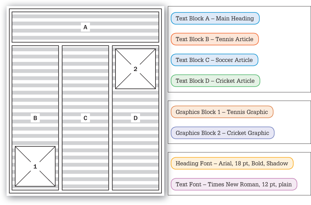
When you start a publication, careful planning is required. A sketch called a thumbnail sketch is drawn on paper. This is where you decide where to place the text and graphics on the page, what fonts are going to be used, what articles and graphics are going to be entered. The following diagram is a sample thumbnail sketch for a sports newsletter. Text boxes are represented by horizontal lines and graphics boxes with crossing diagonal lines.
Design suggestions
Good design can be a personal thing. What is good design for one person may be considered to be poor design for someone else. However, following a few general design suggestions can help you create universally accepted, well-designed publications.
- ‘Keep it simple, stupid’ (KISS). Don’t try to cram too much information into any one area. White space or empty areas can enhance the appearance of a document. A document with too much text becomes uninteresting and difficult to read. Simple, clear publications get the message across much more effectively.
- Don’t use too many fonts. Two or perhaps three different fonts are the maximum that should be used. Try to use the same font and style for each article. Usually serif fonts such as Times, Times New Roman, Palatino and Century Schoolbook are preferred for articles as they are easier to read. Try to keep the same font and style for all the headings. Consistent use of fonts and styles throughout a publication is advisable.
- Always take care to align all sections of the page. This means that tops and sides of adjacent text and graphics should be level with one another.
- If you are using columns in newsletters, three columns should be used so that there are no more than 40 characters across each column. Text in columns looks better full justified.
- Minimise the use of uppercase letters.
Publishing steps
Basically, four steps should always be followed in any publishing process.
- Create a thumbnail sketch of the page layout on paper.
- Create the page layout.
- Enter the text and graphics.
- Finally, print a draft copy, make any necessary changes, reprint and check before final printing.