9.10 Adaptive and responsive webpages
If you wish to start creating more detailed sites you will need to learn how to create webpage layouts that respond to different screen sizes. These are termed responsive and adaptive layouts. A responsive layout will adjust to any screen size that a user opens the site on and it usually requires more detailed setting up. An adaptive layout adjusts to predetermined screen sizes; for example, for a desktop screen, a tablet screen and a mobile phone screen.
Webpage authoring exercise 10
Adaptive and responsive webpages
Skills practised
- Responsive layouts
- Adjusting screen sizes
Dreamweaver provides some sample templates that use a responsive layout.
- Close all the open files then display the
FILEmenu and selectNEW. - Click on the
STARTER TEMPLATESoption, selectRESPONSIVE STARTERSand selectECOMMERCE.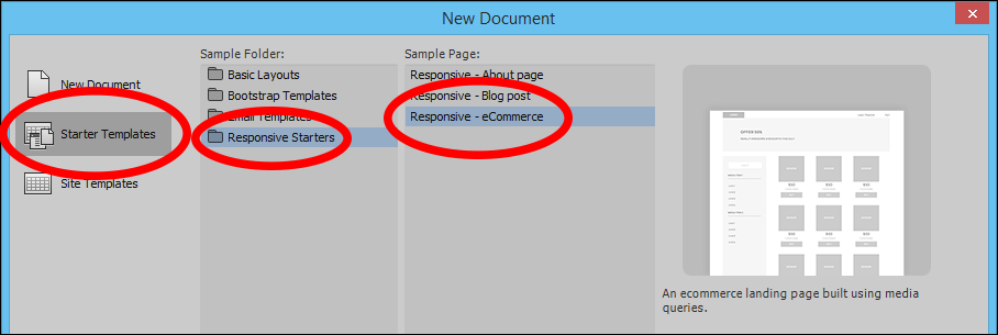
- Select
CREATE, save the page in your MovieMagic folder under the file name layout.html andCOPYthe dependent files when asked. - Turn on
LIVEview, adjust the width of the screen using the bar at the right and notice how the page elements change as the screen width changes. - You could adjust the layout of the page and save it as a template so that other pages could be created from it.